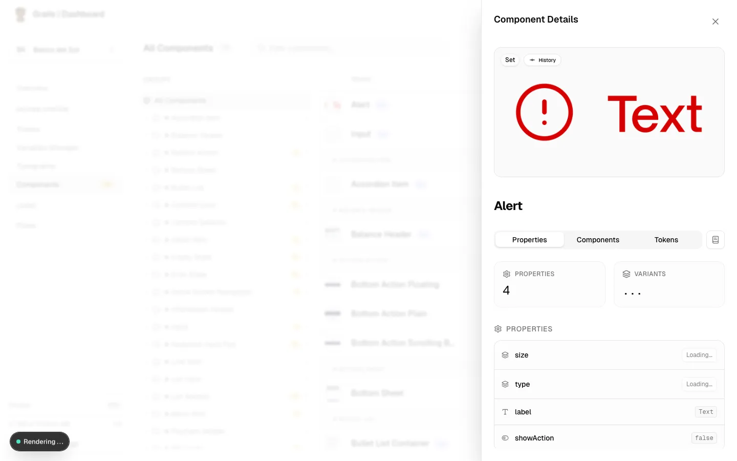
Component Details Panel
Clicking on any component in the library opens the Component Details Panel — a side drawer that gives you full structural visibility into that component. It’s organized into three tabs: Properties, Components, and Tokens.
Properties Tab
The Properties tab is the primary view for inspecting a component’s structural definition as captured from Figma.
Header Stats
At the top you’ll find a quick summary:
- Properties count — total number of defined properties.
- Variants count — total number of designed variant combinations.
Consolidated Properties List
Every property the component exposes is listed here. Grails supports four property types from Figma:
| Type | Description |
|---|---|
| Variant | Categorical property with a fixed set of string values (e.g., size = sm / md / lg). |
| Boolean | An on/off toggle (e.g., hasIcon = true / false). |
| Text | An editable text string (e.g., label = "Button"). |
| Instance Swap | A slot that accepts a different component as content (e.g., an icon slot). |
Variant Switcher
When the component is a component set, the Properties tab includes an interactive switcher. Use the dropdowns to navigate between different variant states and inspect the exact property values and tokens applied to each specific combination.
Modes
If the component references variable collections that publish multiple modes (e.g., Light/Dark, Brand A/Brand B), the available modes are displayed here as labels so you can understand how this component adapts at runtime.
Components Tab
The Components tab maps the dependency graph of the component — both inward (what it relies on) and outward (what relies on it).
Sub-components
Lists every component nested inside this one as an instance swap or a structural element. Each sub-component is a link that opens its own drawer.
If a sub-component changes its API (e.g., a renamed property), that change can propagate upward and affect this component’s behavior in code.
Used In
Lists every parent component or pattern that uses this component. This reverse-lookup is essential when evaluating the blast radius of a breaking change — if you modify a base component like Icon, you can instantly see all the components that depend on it.
Tokens Tab
The Tokens tab lists every design token (variable) bound to this component, organized by collection.
What You’ll See
- Collection grouping — tokens are grouped by their source variable collection (e.g.,
Colors,Spacing,Typography). - Alias path — shows the semantic alias chain (e.g.,
color.brand.primary→#5C6EFF). - Resolved value — the final computed value (hex color, pixel value, etc.).
- Color swatch — a small inline preview for color tokens.
Why This Matters
Token bindings are what make a component adaptable across themes and modes. The Tokens tab lets you verify that every visual property on this component is properly wired to your design system — not hardcoded. Any deviation (a raw value instead of an alias) will also be flagged by the Component Health Index.