Components
Introduction
The Components section is your comprehensive library of all design system components that have been synced from Figma. It allows you to explore component sets, inspect individual variants, view property definitions, and understand the tokens bound to each component.
Overview
The layout is divided into a navigation sidebar on the left and a main content area on the right, with a top toolbar for searching and changing view modes.
- Search Bar: Quickly find specific components by name.
- View Toggles: Switch between a List (Table) view and a Grid (Cards) view.
- Component Count: Displays the total number of synced components.
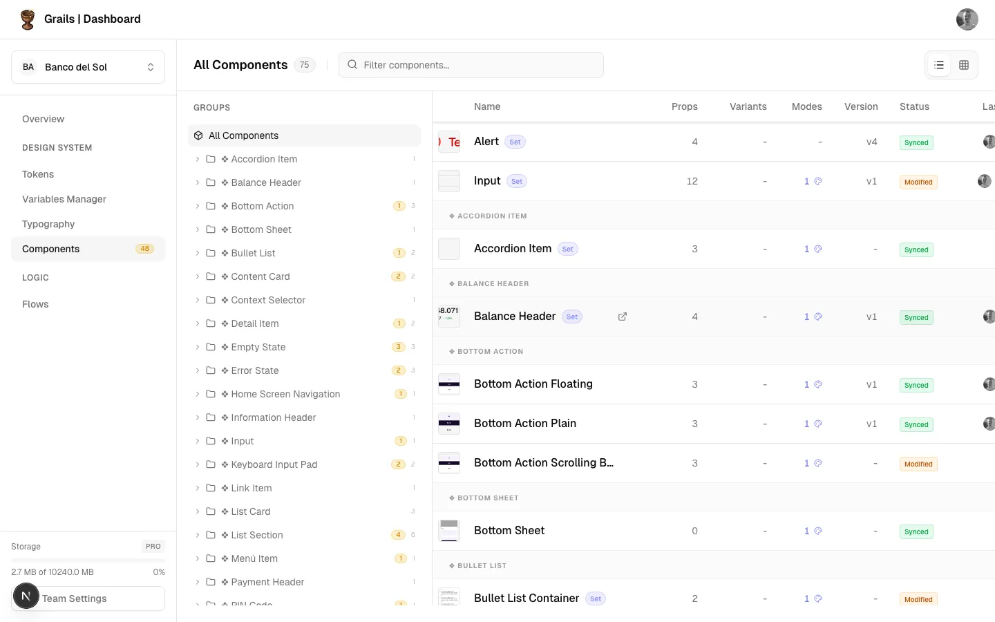
Component Library
The main area lists your components. You can view them in two distinct modes:
List View
Organizes components in a structured table.
- Component Name: The name of the component, grouped by its Figma path.
- Variants: Indicates how many variants exist within a component set.
- Status: Shows if a component is up to date or outdated in Figma.
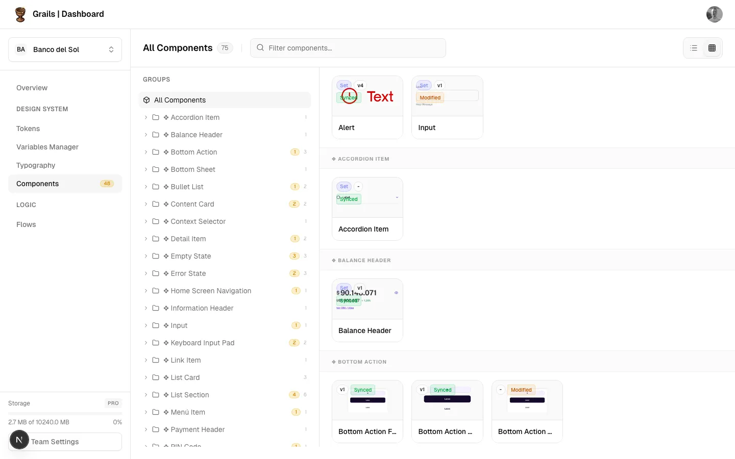
Grid View
Provides a more visual browsing experience.
- Displays realistic thumbnails of each component.
- Shows variant counts and status badges at a glance.
Component Details Panel
Clicking on any component opens a detailed side panel (Drawer). This panel is divided into three main tabs:
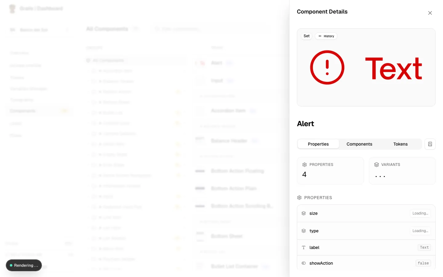
Properties Tab
Displays the structural definition of the component.
- Properties & Variants Count: High-level stats of the component set.
- Consolidated Properties List: Shows every property (boolean, text, instance swap, variant) and its current or default value.
- Variant Switcher: If inspecting a component set, you can use dropdowns to switch between different variants and see their specific properties.
- Modes: Displays available modes for the collections used in this component.
Components Tab
Shows relationships between components.
- Sub-components: Other components nested inside this one.
- Used In: Larger components or patterns that use this component.
Tokens Tab
Lists all design tokens (variables) applied to this component.
- Grouped by Collection (e.g., Colors, Spacing).
- Shows the alias path resolving to the final hex/pixel value.
- Provides a color swatch for visual reference.
Documentation Panel
For components that have extended markdown documentation, you can click the Book icon in the drawer to open a secondary Documentation Drawer stacked on top. This displays rich text guidelines, usage examples, and designer notes.
Available Actions
| Action | Roles | Description |
|---|---|---|
| Switch View Modes | Admin, Editor, Viewer | Toggle between List and Grid representations using the toolbar icons. |
| Search Components | Admin, Editor, Viewer | Filter the list or grid by component name. |
| Inspect Details | Admin, Editor, Viewer | Click a component to open the details pane and explore properties, variants, and tokens. |
| View Documentation | Admin, Editor, Viewer | Click the Book icon in the details pane to read extended usage guidelines. |
Permission Notes
All roles (Admin, Editor, Viewer) have access to browse the components library. Only Editors and Admins have access to pull updates from Figma using the plugin, but the results are visible to Viewers here.